Microsoft’s new logo is intended to invoke the onscreen tiles of its new touch-based software for smartphones and tablet computers.
Microsoft Corporation is an American multinational corporation headquartered in Redmond, Washington, United States that develops, manufactures, licenses and supports a wide range of products and services related to computing. The company was founded by Bill Gates and Paul Allen on April 4, 1975. Microsoft is the world’s largest software maker measured by revenues. It is also one of the world’s most valuable companies.
In Aug 2012, Microsoft unveiled its updated logo (shown above) which is essenially a simplified version of the Windows logo. The Windows logo had the four colors, Blue, Orange, Green and Yellow in the form of a wave. However with the Microsoft logo, they are simple square blocks. In addition, the Microsoft font is no longer italicized but a simpler lighter type font. The font is the Segoe font, which is a font that Microsoft had created and uses in its products and marketing materials for many years. The font apparently figures prominently in the new Windows 8 interface as well. The one element that they have retained from the previous logo is the connection between the letters ‘f’ and ‘t’.
Overall, since we have seen the Windows logo for so many years, its hardly a noticable change and perhaps some readers may even wonder, “Isn’t that how the logo was in the first place?”. The company is at an important point in their history with the launch of Windows 8. Hopefully the product is a much bigger success than this logo.
A history of Microsoft Logo’s
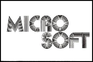
1975 – 1979
The original logo was a “groovy logo” and reflective of the 70’s and 80’s. A logo with glowing Disco lights.
1980 – 1981

In 1980, Microsoft updated its logo to have the word Microsoft on a single line. The logo and remind of a 80’s hair band for some reason
1982 – 1986
The old logo, which was green, in all uppercase, and featured a fanciful letter O, nicknamed the blibbet, but it was discarded. Microsoft “blibbet” logo, used until 1987.
1987 – 2012
In 1987, Microsoft adopted its current logo, the so-called “Pacman Logo”. The logo was designed by Scott Baker. According to the March 1987 Computer Reseller News Magazine, “The new logo, in Helvetica italic typeface, has a slash between the o and s to emphasize the “soft” part of the name and convey motion and speed.
1994 – 2002
Microsoft logo with the 1994–2002 slogan “Where do you want to go today?”
2006 – 2012

Microsoft logo as of 2006, with the slogan “Your potential. Our passion”


GIPHY App Key not set. Please check settings
One Comment